ShopDreamUp AI ArtDreamUp
Deviation Actions
Suggested Deviants


![Uncharted 3 Drake's Deception [2011] (6)](https://images-wixmp-ed30a86b8c4ca887773594c2.wixmp.com/f/40eb3ade-91e8-48e4-9923-dc622562072f/dgjzz1f-e385f890-97e4-4b38-b4a7-b4d9309ae7dc.png/v1/crop/w_92,h_92,x_0,y_0,scl_0.1796875/uncharted_3_drake_s_deception__2011___6__by_kahlanamnelle_dgjzz1f-92s.png?token=eyJ0eXAiOiJKV1QiLCJhbGciOiJIUzI1NiJ9.eyJzdWIiOiJ1cm46YXBwOjdlMGQxODg5ODIyNjQzNzNhNWYwZDQxNWVhMGQyNmUwIiwiaXNzIjoidXJuOmFwcDo3ZTBkMTg4OTgyMjY0MzczYTVmMGQ0MTVlYTBkMjZlMCIsIm9iaiI6W1t7ImhlaWdodCI6Ijw9NTEyIiwicGF0aCI6IlwvZlwvNDBlYjNhZGUtOTFlOC00OGU0LTk5MjMtZGM2MjI1NjIwNzJmXC9kZ2p6ejFmLWUzODVmODkwLTk3ZTQtNGIzOC1iNGE3LWI0ZDkzMDlhZTdkYy5wbmciLCJ3aWR0aCI6Ijw9NTEyIn1dXSwiYXVkIjpbInVybjpzZXJ2aWNlOmltYWdlLm9wZXJhdGlvbnMiXX0.JvLXlBYKwLvRMZzHqPmlKTLvWgSpRGecesGmOGyp8tk)
![Quantum Break [2016] (2)](https://images-wixmp-ed30a86b8c4ca887773594c2.wixmp.com/f/40eb3ade-91e8-48e4-9923-dc622562072f/dgjzs5e-2a585541-29d8-445d-bf2a-7ca37284c5fe.png/v1/crop/w_92,h_92,x_0,y_0,scl_0.1796875/quantum_break__2016___2__by_kahlanamnelle_dgjzs5e-92s.png?token=eyJ0eXAiOiJKV1QiLCJhbGciOiJIUzI1NiJ9.eyJzdWIiOiJ1cm46YXBwOjdlMGQxODg5ODIyNjQzNzNhNWYwZDQxNWVhMGQyNmUwIiwiaXNzIjoidXJuOmFwcDo3ZTBkMTg4OTgyMjY0MzczYTVmMGQ0MTVlYTBkMjZlMCIsIm9iaiI6W1t7ImhlaWdodCI6Ijw9NTEyIiwicGF0aCI6IlwvZlwvNDBlYjNhZGUtOTFlOC00OGU0LTk5MjMtZGM2MjI1NjIwNzJmXC9kZ2p6czVlLTJhNTg1NTQxLTI5ZDgtNDQ1ZC1iZjJhLTdjYTM3Mjg0YzVmZS5wbmciLCJ3aWR0aCI6Ijw9NTEyIn1dXSwiYXVkIjpbInVybjpzZXJ2aWNlOmltYWdlLm9wZXJhdGlvbnMiXX0.noIb3mwP7-n1AMRkmTNWCl4qHWibUqr5WXxK4LALZ4Y)
![Uncharted Lost Legacy [2017] (3)](https://images-wixmp-ed30a86b8c4ca887773594c2.wixmp.com/f/40eb3ade-91e8-48e4-9923-dc622562072f/dgjzz1y-aa10b200-6ead-4f6d-9103-36f7ccce8bba.png/v1/crop/w_92,h_92,x_0,y_0,scl_0.1796875/uncharted_lost_legacy__2017___3__by_kahlanamnelle_dgjzz1y-92s.png?token=eyJ0eXAiOiJKV1QiLCJhbGciOiJIUzI1NiJ9.eyJzdWIiOiJ1cm46YXBwOjdlMGQxODg5ODIyNjQzNzNhNWYwZDQxNWVhMGQyNmUwIiwiaXNzIjoidXJuOmFwcDo3ZTBkMTg4OTgyMjY0MzczYTVmMGQ0MTVlYTBkMjZlMCIsIm9iaiI6W1t7ImhlaWdodCI6Ijw9NTEyIiwicGF0aCI6IlwvZlwvNDBlYjNhZGUtOTFlOC00OGU0LTk5MjMtZGM2MjI1NjIwNzJmXC9kZ2p6ejF5LWFhMTBiMjAwLTZlYWQtNGY2ZC05MTAzLTM2ZjdjY2NlOGJiYS5wbmciLCJ3aWR0aCI6Ijw9NTEyIn1dXSwiYXVkIjpbInVybjpzZXJ2aWNlOmltYWdlLm9wZXJhdGlvbnMiXX0.SBZNDwrdb_s0d2AYUniARG3SGXooFaxHDEnrR1RQGcM)
Suggested Collections


You Might Like…


Featured in Groups


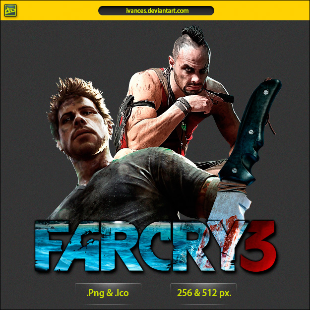
Description
Far Cry 3.
512 .png, 256 .png & .ico, enjoy it.
512 .png, 256 .png & .ico, enjoy it.
Comments7
Join the community to add your comment. Already a deviant? Log In
Many thanks  (Smile)")